← Back to Work
Financial Technology
Designing a funding application flow that people could actually complete
"Multi-step, multi-document, zero guidance. Most people gave up halfway."
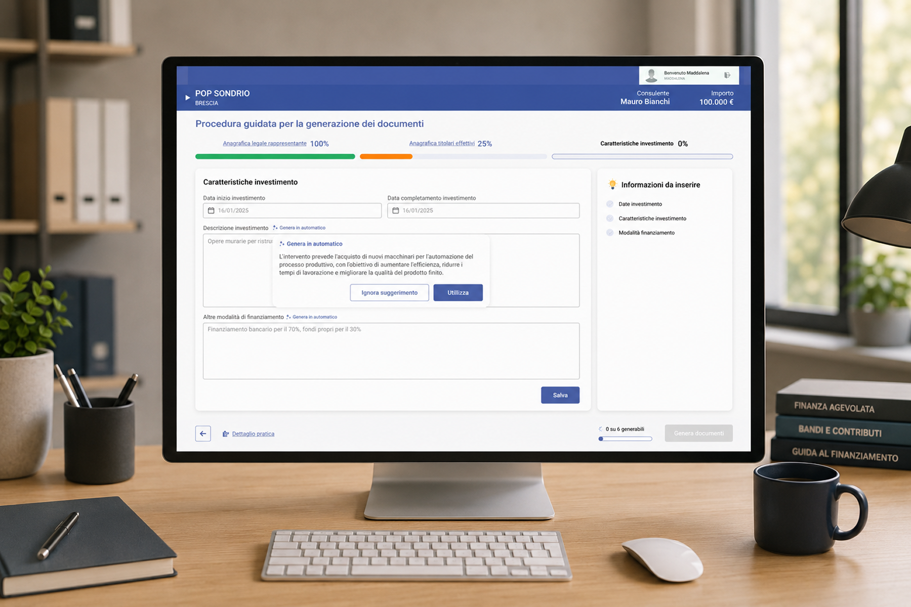
"Multi-step, multi-document, zero guidance. Most people gave up halfway."
The client helps businesses access funding by acting as intermediary between companies and banks. Their existing process was slow and frustrating: users had to manually download, fill out, and upload multiple documents, often giving up halfway. The goal was a guided experience that felt manageable even for first-time users.
100% guided flow
The existing flow was fragmented and discouraging. Instructions were unclear, documents needed to be downloaded separately, and there was no indication of progress. Users didn't know if they were doing it right until it was too late.
"I thought I did it wrong"
most common user sentiment
Multiple downloads
No automation, full manual effort
Analyzed the original process end to end and mapped where people dropped off and why. The main issues were unclear instructions, document overload and no sense of progress. Users did not know if they were doing it right until it was too late.
Redesigned the experience as a step-by-step flow that felt more like a guided conversation. Questions were grouped logically with contextual tips to help users respond with confidence. The goal was to make each step feel manageable, not overwhelming.
Key features included auto-filling documents based on user responses, real-time validation, and automatic extraction of identity data from uploaded ID scans. By the time a user hit submit, documents were generated and ready: no redundant effort from the user.
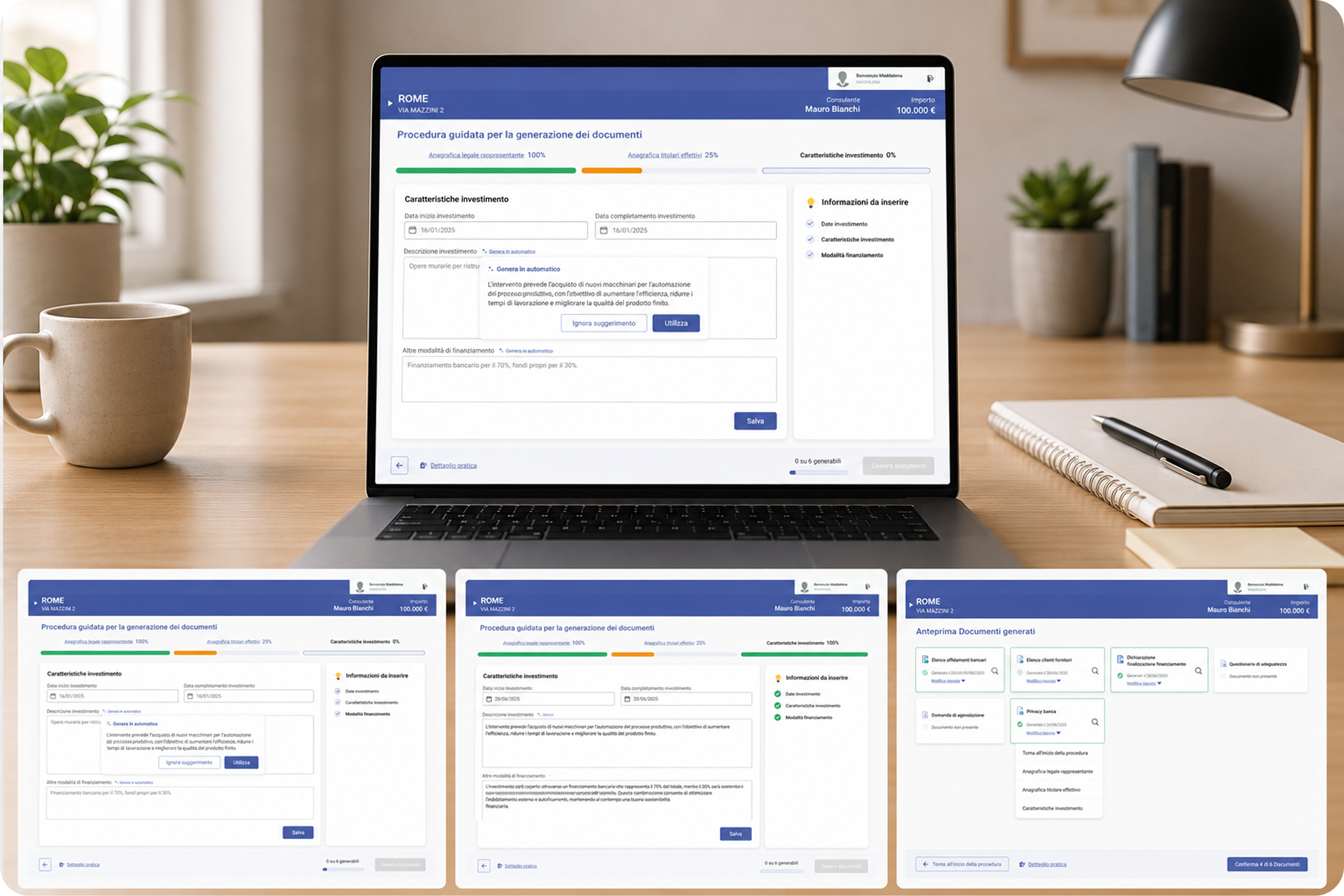
Complete flow without external support or clarification
Documents auto-generated, no manual download or upload
Designed for first-timers: every step in plain language
Designing for high-stakes processes is different. When someone is applying for serious funding, they're not just filling a form, they're making an important decision and don't want to get it wrong. Every design choice had to reduce not just friction, but also anxiety.