← Back to Work
Fashion & Retail · Mobile + Desktop
Designing for global store teams with different needs and different devices
"Same team. Completely different needs. Completely different devices."
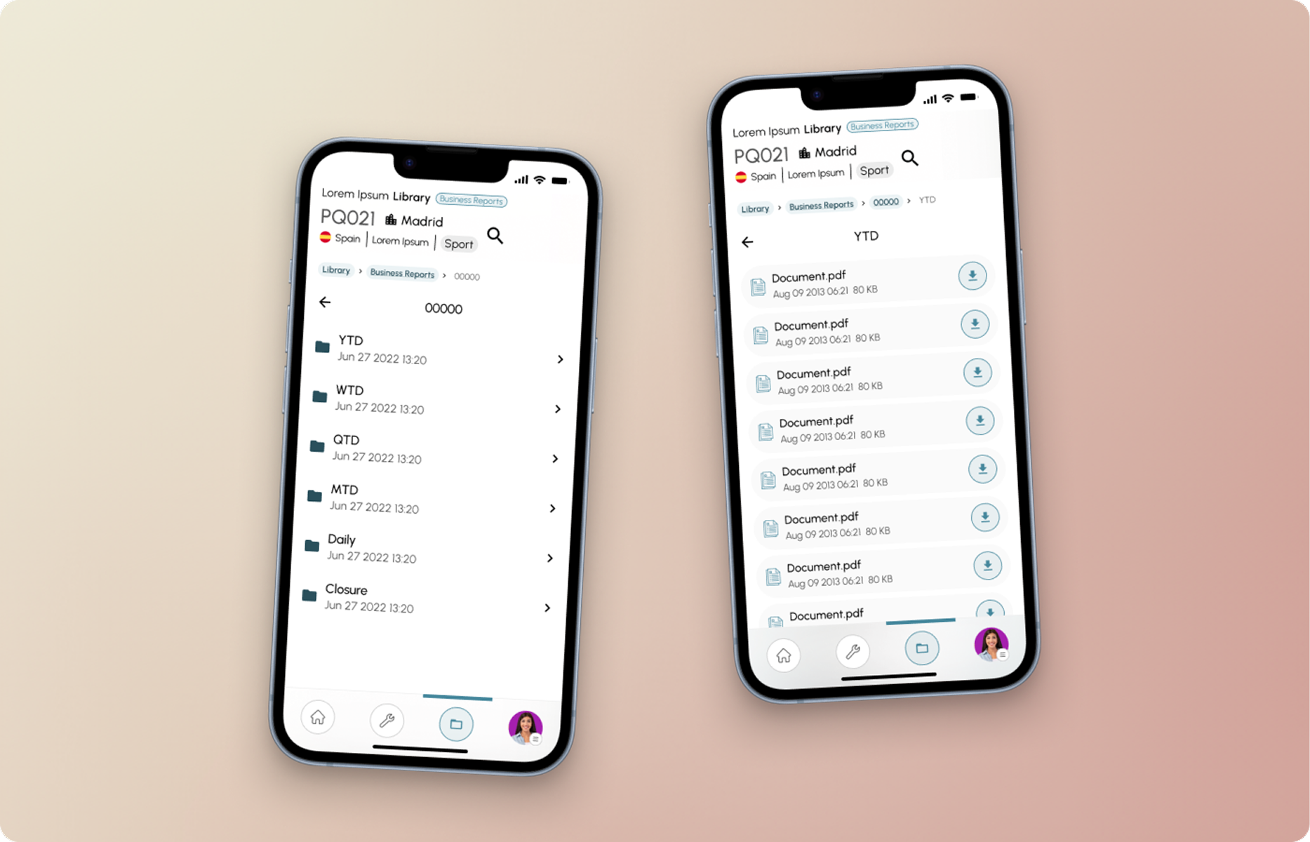
"Same team. Completely different needs. Completely different devices."
A globally operating fashion brand needed two integrated digital tools for store operations: a desktop platform for managers (planning, reporting, oversight) and a mobile app for associates (daily tasks, floor management). Two user groups, fundamentally different contexts, and the tools had to work together without sharing UI complexity.
2 platforms, 1 data layer
Store managers lived in spreadsheets and emails. Associates lived on their phones. Any solution requiring both to use the same interface would fail one of them. The challenge: create two distinct products that felt like siblings, sharing data without sharing complexity.
"I cannot use the same thing on my phone as on a computer"
store associate research
Two different mental models
Manager = plan. Associate = execute.
Shadowed managers during planning shifts and associates during floor work. The gap between their mental models was wider than expected: managers thought in weeks, associates thought in the next two hours. That gap shaped every design decision.
Defined what data both tools needed to share before designing either interface. This meant decisions about shifts, tasks and team availability were made once and reflected everywhere, without forcing users to duplicate work across systems.
Ran usability sessions across multiple markets with teams speaking different languages. Icon-heavy navigation consistently outperformed text labels for speed and comprehension, especially in time-pressured floor environments.
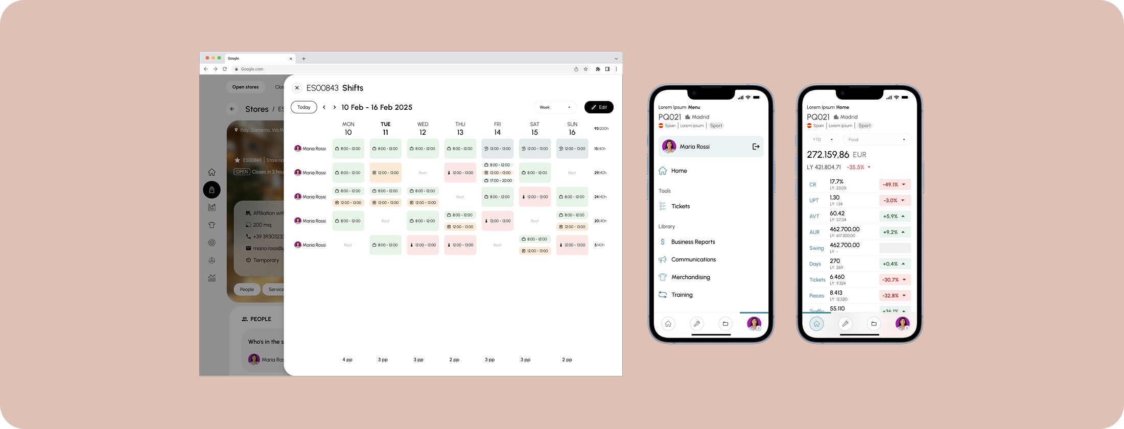
Desktop for managers: planning, oversight, team tasks
Mobile for associates: execution, daily tasks, real-time updates
Shared data layer, both platforms always in sync
Store associates were more tech-savvy than stakeholders assumed. They just had no patience for slow, cluttered UIs. Speed and clarity mattered more than feature richness. Designing for both without compromising either was the real challenge.