← Back to Work
Facility Management · SaaS
When powerful software becomes too complex to use
"A platform with everything. That users actively worked around."
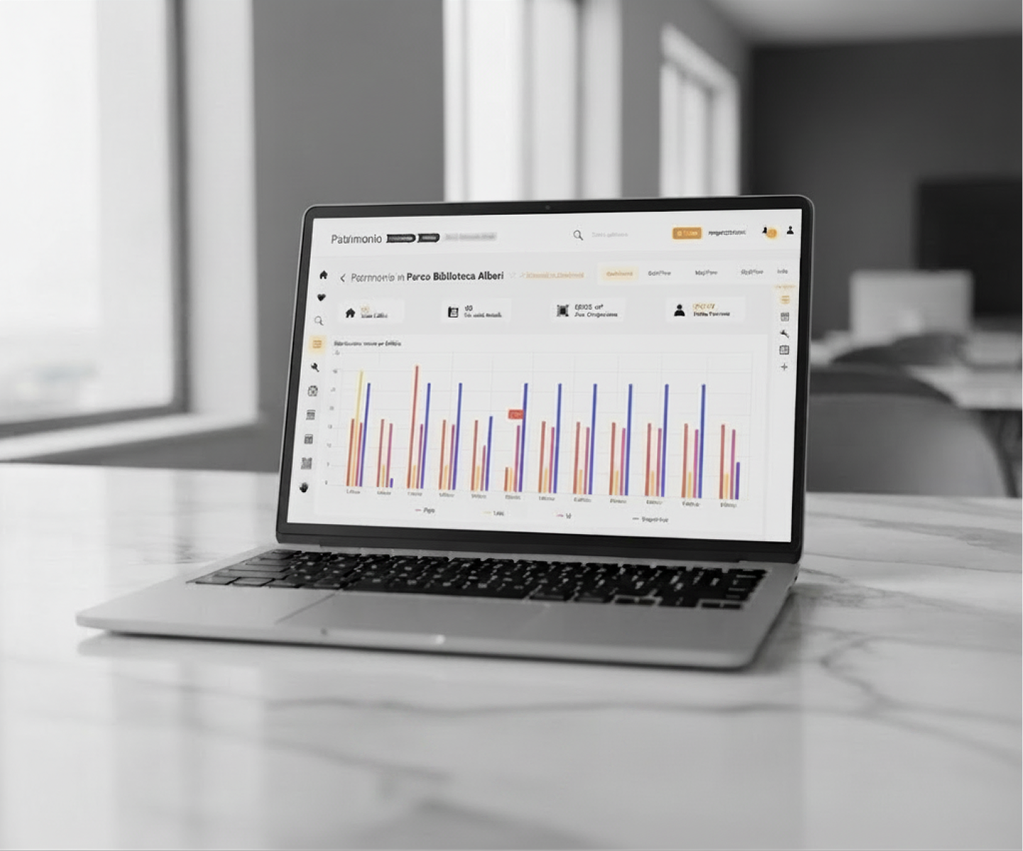
"A platform with everything. That users actively worked around."
The client provides a facility management SaaS used by large organizations to manage buildings, maintenance, and operations. Despite being feature-rich, users created workarounds: spreadsheets, sticky notes, WhatsApp groups, because the interface made simple tasks unnecessarily complex. Goal: redesign around what users actually needed to do.
Core paths: 4 screens → 1
Years of accumulated features, none ever removed. Navigation required knowing where things were before you could find them. New users took weeks to become productive. Experienced users had memorized paths that no longer made logical sense.
"I know it is in there somewhere"
defining quote from research
Weeks to onboard
before feeling productive
Conducted a task analysis of 12 common actions across different user roles. Only 3 matched the path the system expected. The other 9 required users to know where things lived before they could find them: that is how feature fog gets built.
Ran card sorting sessions with real users across different departments and reorganized the information architecture around what users were trying to achieve, not around how the system was built. Goals first, capabilities second.
Kept all power features in the product but removed them from primary navigation. Advanced functionality was surfaced contextually, only when users needed it in their workflow. First-time users could complete core tasks without encountering edge cases.
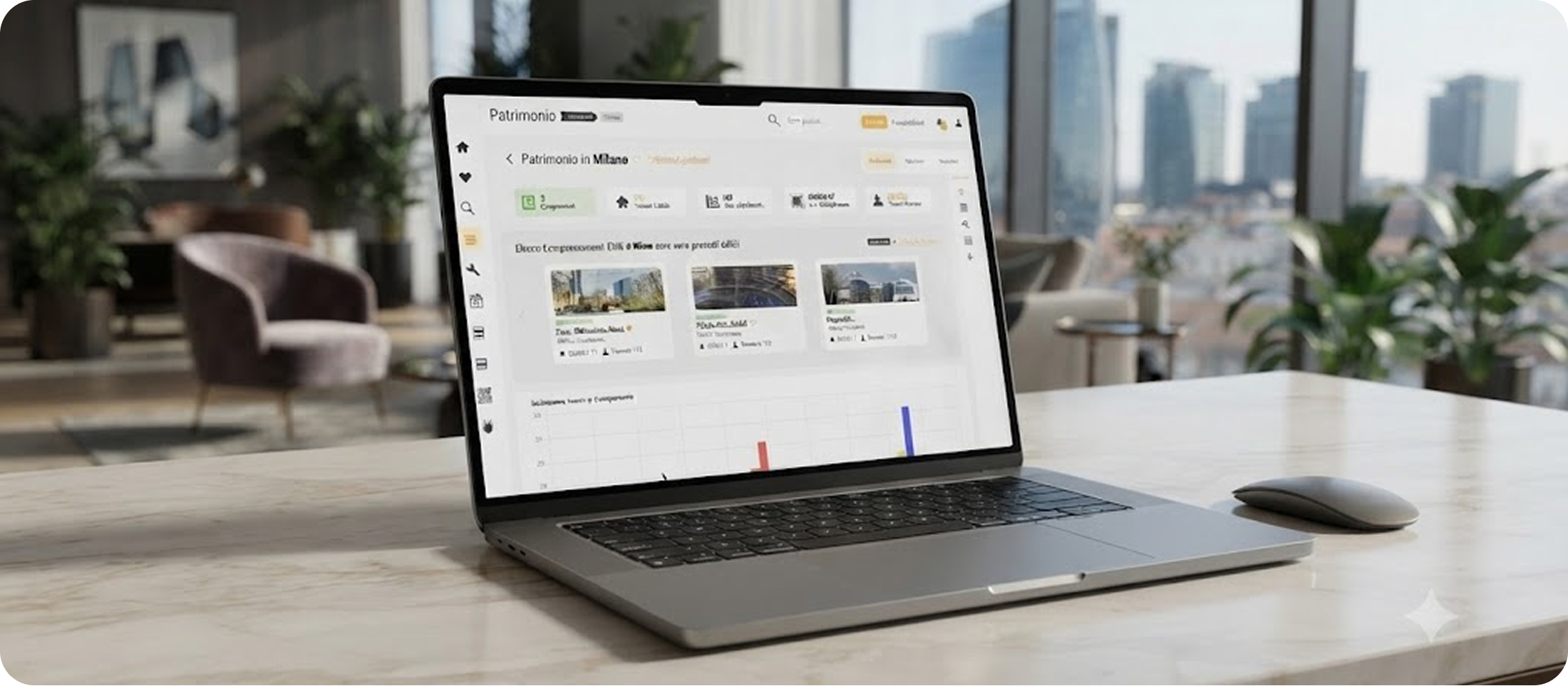
Core task paths reduced from 4+ screens to 1-2 interactions
IA reorganized around user goals, not system logic
Advanced features preserved via progressive disclosure
The hardest part wasn't designing the new experience. It was convincing stakeholders that removing visible features could increase the product's value. Simplicity is a hard sell to teams who built every feature for a reason. Data from user testing was the only language that worked.