← Back to Work
AI SaaS · Landing Page
Designing a landing page that doesn't tell a story. It is one
"Complete creative freedom. A wow effect. 48 hours. And one instruction hidden in the brief: build the page around this story."
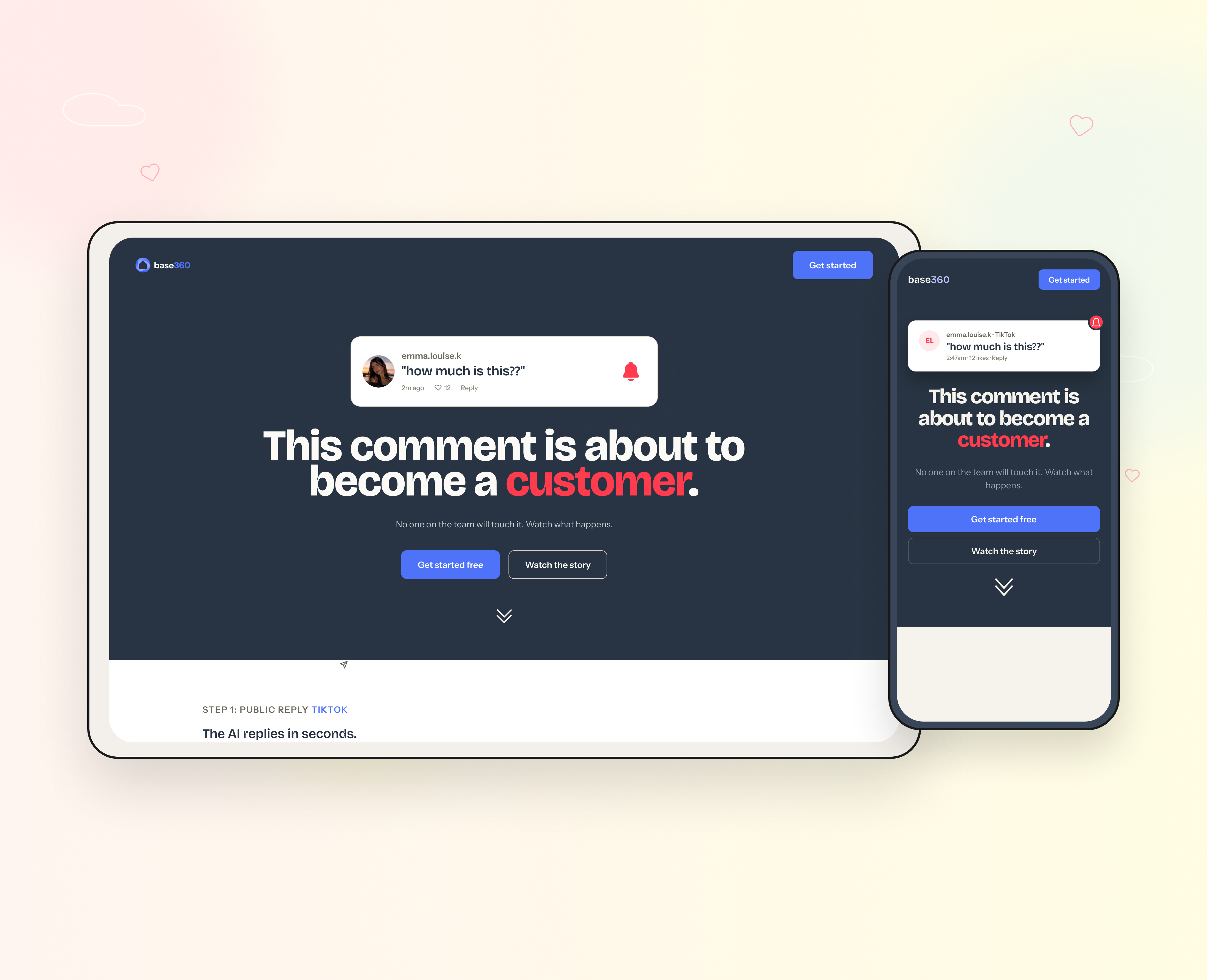
"Complete creative freedom. A wow effect. 48 hours. And one instruction hidden in the brief: build the page around this story."
An AI-native SaaS startup was repositioning: born as the internal software of a short-term rental operator, it was becoming a standalone product for B2C brands. One system unifying every comment, DM, call and email, with AI agents handling conversations end to end. They needed a landing page for the new positioning. The brief gave total creative freedom, asked for a "wow effect", and pointed at one hero example: a TikTok comment that becomes a paying customer, automatically.
48h from brief to delivery
With no constraints, most landing pages converge on the same safe layout: headline, three benefits, feature grid, CTA. Correct, and forgettable. But the brief contained one line almost everyone would treat as content instead of architecture: "this is the story the whole page should tell." Taking that line literally became the entire project.
"Build the page around this"
the one instruction that mattered
90% of solutions
converge on the same safe layout
Before opening Figma, I looked at what the company actually was: a product mid-pivot, a live site still speaking to the old vertical, a logo carrying a house icon from the rental days. I mapped the competitive space, enterprise AI support tools on one side, consumer DM automation on the other, and found the gap the product sits in. The buyer is a B2C founder or marketer: someone who lives inside TikTok and Instagram, already knows the pain, and needs to see the difference, not read about it.
The page opens at night: a comment posted at 2:47am, nobody awake, a red notification ringing in the dark. Scrolling turns night into day, the system working while the team sleeps. Five steps show one comment becoming a €39 order across real channel UIs, with the same fictional brand, person and price kept consistent from first comment to final purchase. Color works semantically: red is the unread notification, blue is the system acting, green is the problem solved. A CTA sits inside the story at the moment of highest intent, not at the bottom, where attention has already decayed. The structure held from the start; the visual system took several rounds of trying, discarding and simplifying to get there.
I built the page with an AI-assisted workflow: structured HTML imported into Figma for speed and consistency, then an animated prototype for everything static frames can't show. The sticky glass header, scroll reveals, the bell ringing, the counter running to 347, a DM writing itself. I closed the file the way I'd hand it to a team: style foundations, a mobile version, and a "start here" panel documenting every decision, the assumptions I made, and the two A/B tests I'd run after launch.
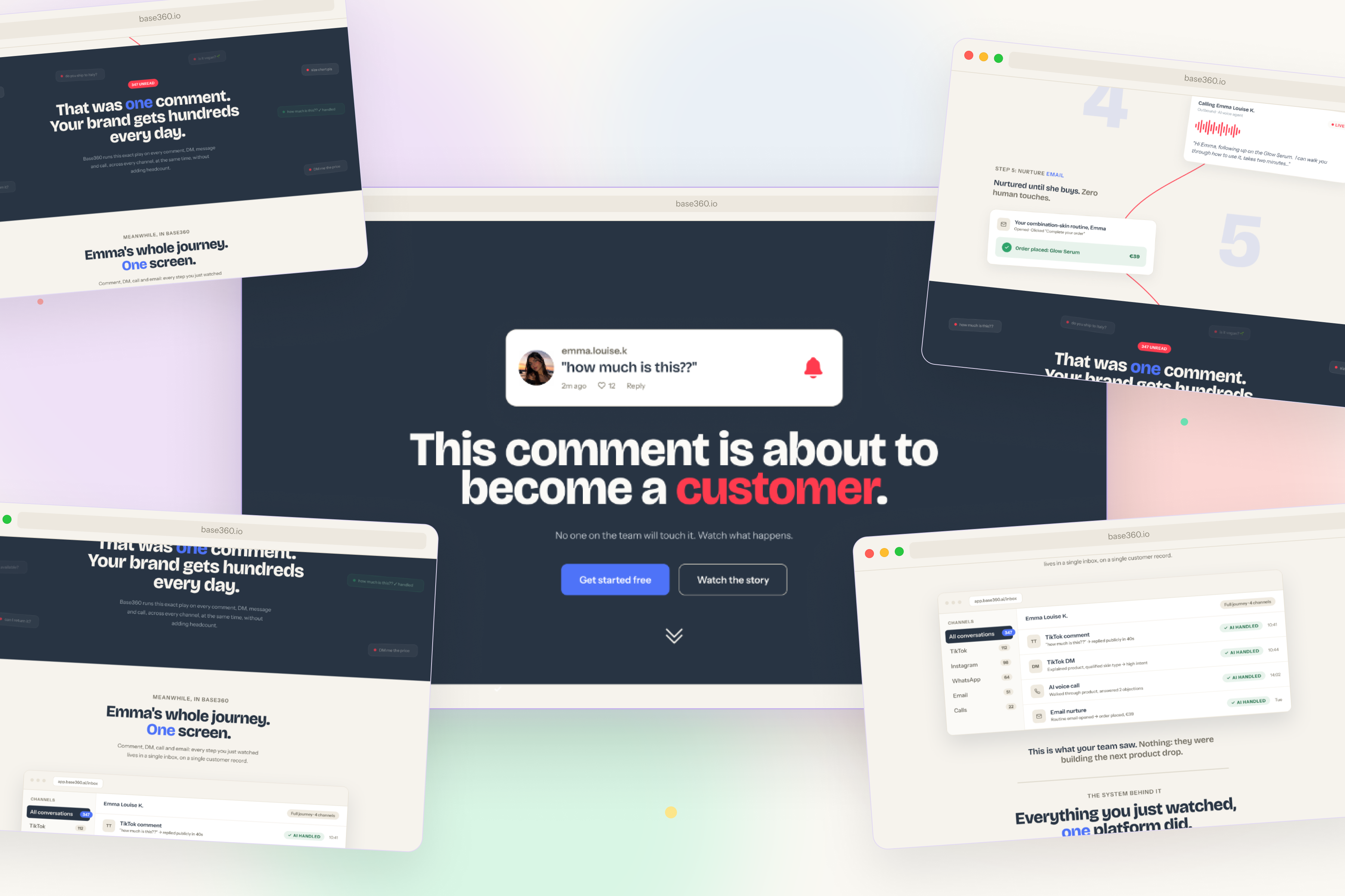
Full delivery in 48 hours: desktop, mobile, animated prototype, documented rationale
One small system: 5 semantic colors, 2 typefaces, reusable components built to extend into the product
Every decision documented: assumptions declared, post-launch tests defined
Freedom in a brief doesn't make work more creative. It makes everyone converge on the same safe answer. The real brief is almost always hidden in one line. The job is finding it, taking it seriously, and having the reasoning to defend where it takes you.